A mobile problem can be difficult to explain in words. A call drops near a doorway, a page stops loading on a train, or a connection seems different between two rooms. A short visual explanation can make the situation easier to understand. But the moment an illustration looks like a measurement,
it can also make a claim that the original observation never supported.
A useful approach separates three kinds of material: records of what happened, diagrams that explain an idea, and motion that helps someone follow the explanation. Each serves a different purpose. Keeping those purposes visible lets a reader understand the problem without confusing a visual story
with evidence about a carrier, device or location.
Start with a narrow question
Before choosing a visual format, write the question you want the material to answer. “Why does this connection fail?” is broad and may require information you do not have. “What happened when the phone moved between these two positions?” is narrower. Even that question needs a distinction between
a recorded observation and a proposed explanation.
Suppose you want to explain a hypothetical phone moving from a desk to a hallway. You can draw those two positions and show the movement. You cannot infer from that drawing that the wall blocked a signal, a tower became overloaded or the carrier changed the connection. Those are possible
explanations, not things a diagram can establish.
Give the visual a modest job: show the sequence, point out the relevant location, or explain what information someone should record next. An illustration does not need a diagnosis to be useful.
Keep observations in their original form
When real observations exist, preserve their meaning before simplifying their presentation. A screenshot might show the interface at one moment. A recording might show a loading indicator or an application message. Neither automatically establishes what happened elsewhere in the network.
Use a caption that describes the visible event. For example, “The application displayed a loading indicator at this point” is different from “The carrier had no coverage here.” The second statement needs independent support. Likewise, a single unsuccessful request does not establish that every
application or every device would behave the same way.
Keep the original record available for review and work from a copy when adding annotations. A crop should not remove a detail that changes the interpretation. A sped-up recording should identify the speed change. If a sequence combines separate moments, mark the joins rather than presenting them
as uninterrupted footage.
Use an owned diagram for the explanation
A simple drawing often explains a mobile situation better than a realistic reconstruction. Create your own outline of a room, a phone and two positions. Use invented labels such as “Position A” and “Position B” rather than reproducing a real account screen or someone's private address.
Draw only the elements needed for the question. A dashed arrow can show movement. A separate box can describe the observation. Another box can list an unanswered question. Leaving those boxes separate prevents a suggested cause from becoming part of the recorded event.
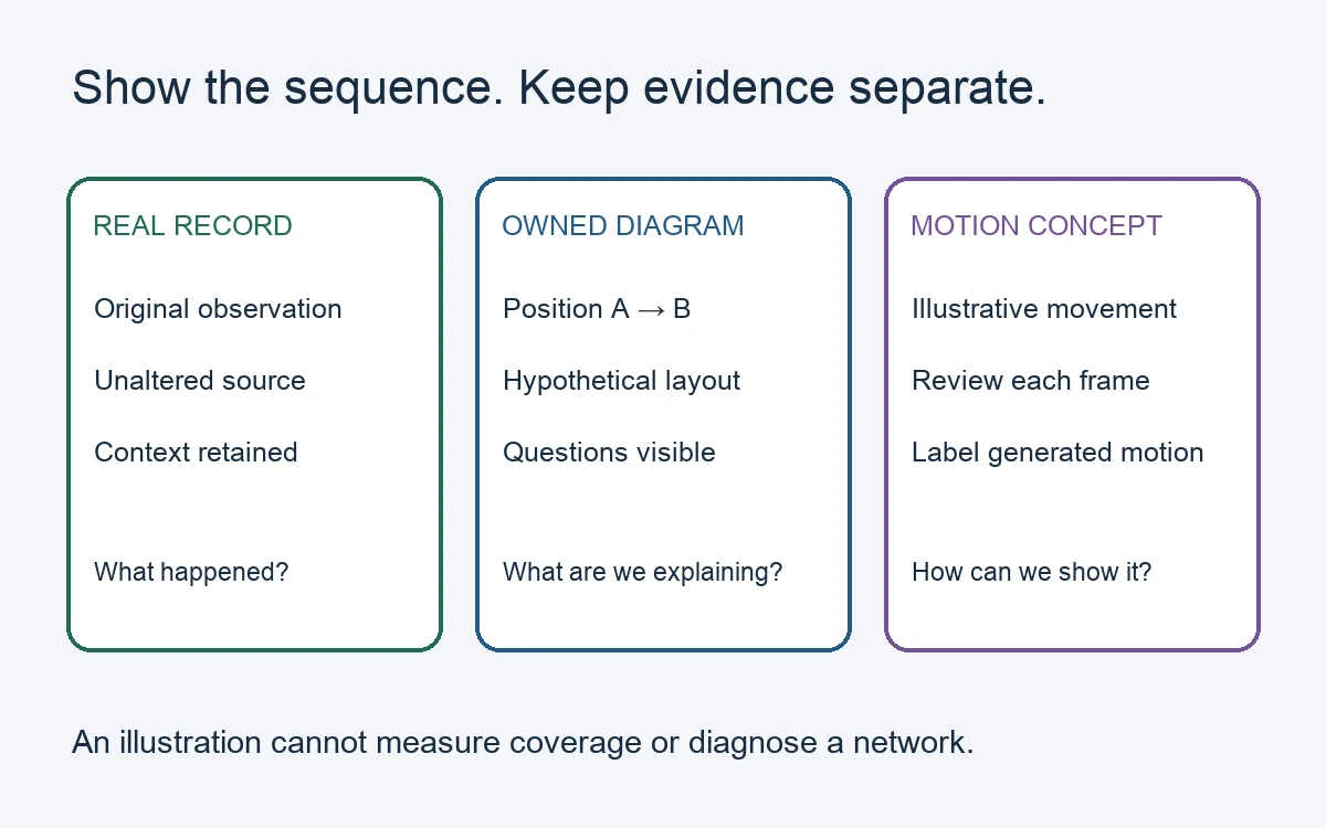
Different visual materials answer different questions. An illustrative diagram explains the sequence; it does not measure network coverage.
Use a small legend if colours or symbols carry meaning. Do not rely on colour alone: write “observed,” “illustrative” and “unknown” beside the corresponding elements. A tower symbol, if necessary, should represent a general network concept rather than a verified tower location.
Animate only the relationships you control
For an exact sequence, authored motion is usually easier to explain. You can move the phone icon along a chosen path, reveal the observation box and then display the unanswered question. The timing and order are deliberate, and the viewer can see precisely which step belongs to which caption.
Keep this motion restrained. A moving arrow is enough to communicate direction. A flashing red signal graphic can imply an alarm or measured failure even when no such event was recorded. Avoid interface animations that resemble a real speed test, carrier notification or diagnostic result.
For example, show the phone icon moving from A to B, followed by a caption reading “Illustrative sequence.” If there is an actual screenshot, place it in a separately labelled panel. Do not animate that screenshot into a different reading or let a drawn signal bar appear to be a continuation of
the recorded interface.
Treat generated motion as an interpretation
Generated motion can provide another way to explore an owned drawing. A creator could use an image-to-video workflow to make a short motion interpretation of a simple device illustration. That output should be presented as an illustration, with its status visible wherever it appears.
It may introduce details that were absent from the drawing or move an object differently from the intended sequence. Review whether the phone, arrows, labels and background remain understandable. If the output changes the meaning, use the still drawing or a controlled animation instead.
A suitable caption might say, “Generated motion from an original illustration; not recorded device behaviour.” This is especially necessary if the material looks photographic. Generated frames cannot supply missing observations, identify the cause of a connection issue or validate a network
measurement.
Build a version that works without motion
Provide a still version with the same sequence and captions. Numbered panels can preserve the explanation when animation is unavailable, distracting or inconvenient to watch. The reader should not need to pause at exactly the right frame to find the main point.
Keep essential text outside the moving image as well. A short accompanying paragraph can state the observation, the purpose of the illustration and the remaining uncertainty. If audio adds information, include that information in text. Motion should support comprehension rather than become the
only route to it.
Review the claim before sharing
Read the finished piece as someone who has not seen the source material. Could they mistake a drawn symbol for a measurement? Could they think a generated clip was captured on a real phone? Does the title promise a cause that the article only proposes?
Correct those ambiguities in the visual and its caption. Keep real records, explanations and interpretations clearly distinct. The result is a mobile story that is easier to follow while remaining honest about what is known and what still needs investigation.
Give an optional narrator a clear explanatory role
For a fictional presenter explaining the device illustration, Magic Hour lip sync AI matches mouth movements to an audio track. Use permitted presenter footage and audio, inspect timing throughout the clip, and label synthetic scenes. Keep
device troubleshooting claims grounded in actual records, and provide readable captions so the explanation also works without sound.
About the contributor: Magic Hour creates tools for making and editing visual content. This article was prepared with AI assistance and submitted for the publisher’s editorial review.


